CoolEvents · Visual identity · Creative direction · Event design
Terrain Race
A physical, outdoors-focused identity for an obstacle event.
Explore the work ↓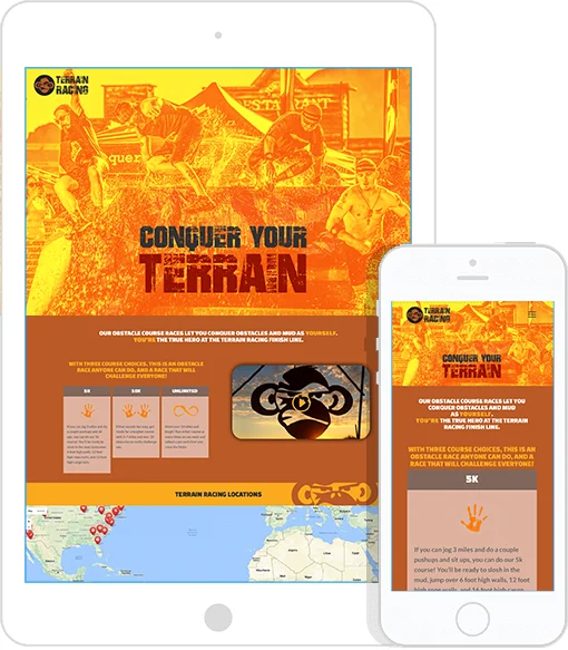
The project
As Director of Brand Development at CoolEvents, I led the visual direction of Terrain Race, from concept development through design execution. The identity translates the physical character of an outdoor challenge into a recognizable visual language.
- My role
- Director of Brand Development, CoolEvents; visual direction, concept development, and design execution
- Scope of work
- Visual concepts and creative direction
- Terrain Racing identity applications
- Tablet and mobile website presentation
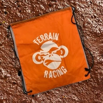
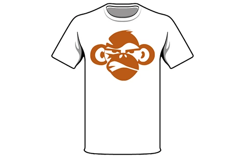
- Drawstring-bag and shirt artwork
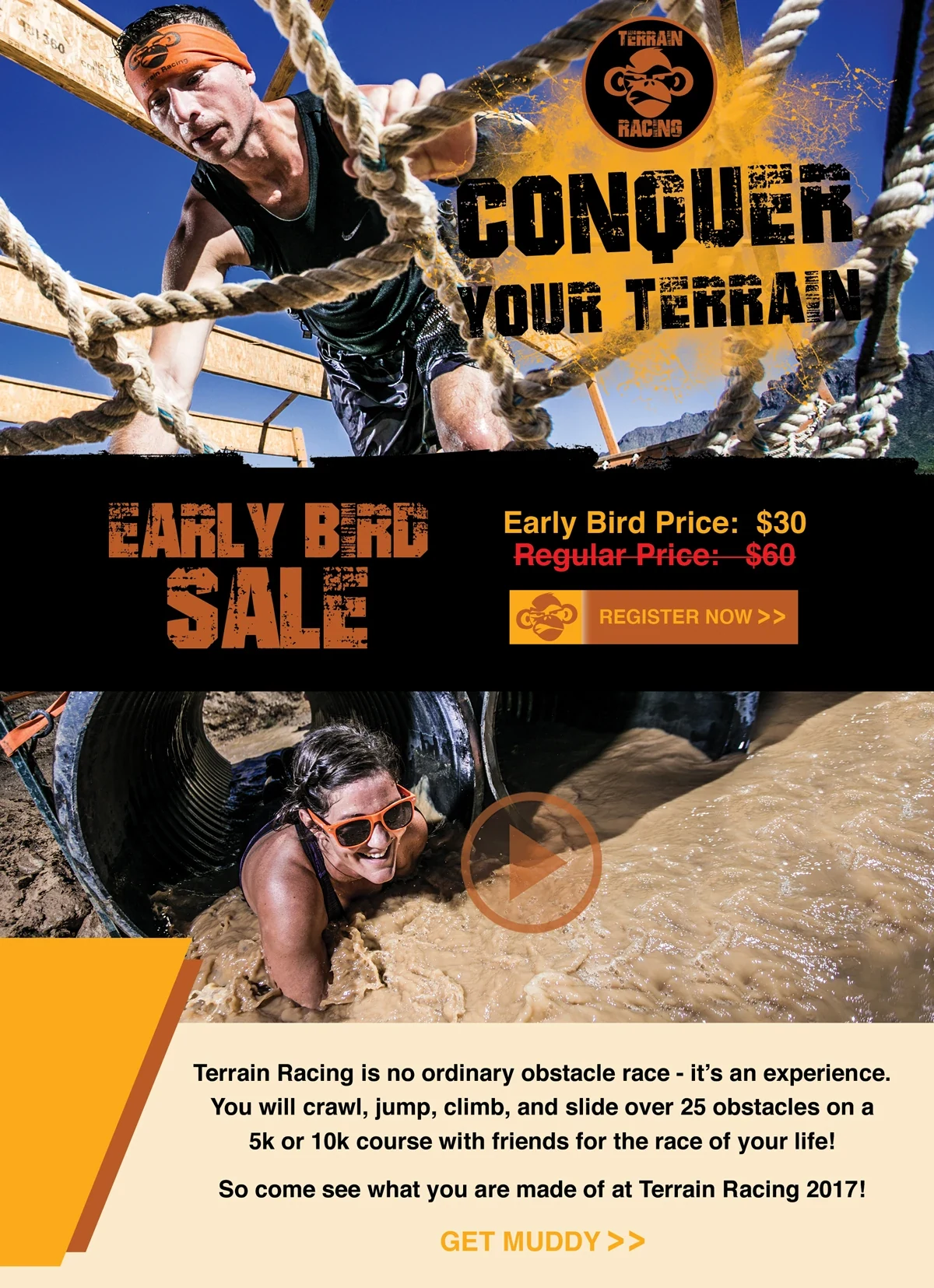
- Digital campaign layouts
The context
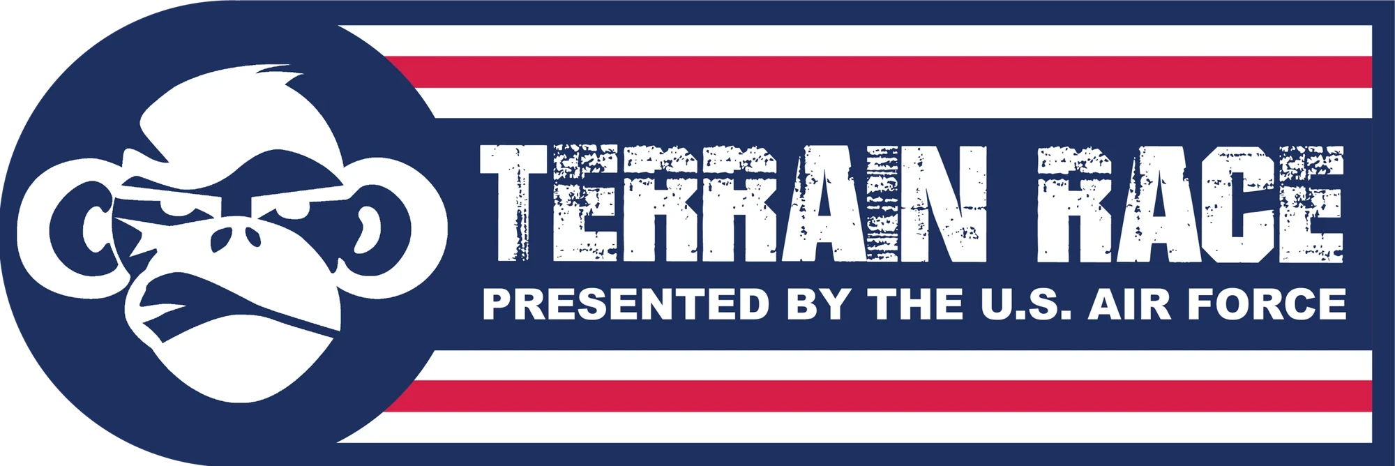
Terrain Race’s archive connects a practical event website and merchandise system with promotion and sponsor presentation. The additional pieces show how the monkey mark and orange palette adapted to campaign, interface and co-branded formats.
Design approach
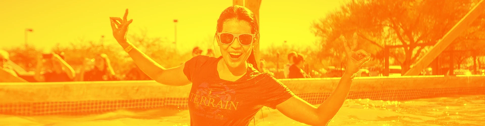
The visual language is compact and physical: rugged lettering, a direct symbol and active obstacle imagery. A complete promotional composition moves from challenge to offer to explanation. At smaller scales the same symbol simplifies; in sponsor artwork it shares a clear horizontal lockup with the U.S. Air Force.
01 / Project details
Campaigns & communication

02 / Project details
Identity in use

03 / Project details
The digital experience
Selected work from my design archive. Campaign dates, offers, and contact details pictured in the original materials are historical. Photography and client identities remain credited to their respective creators; my contribution is described above.