Student Campaigns / Academic proposals
One idea.
Many forms.
A shared direction.
A connected experience.
A campaign connects the identity, the message, and the next step across formats. These three student proposals explore that relationship through advertising, brand identity, and digital design, with teaching or mentorship by Jared Trask.
Art direction across formats
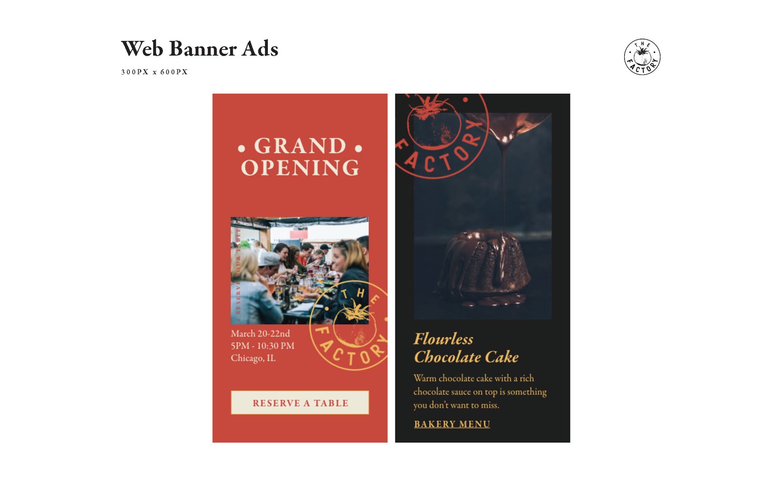
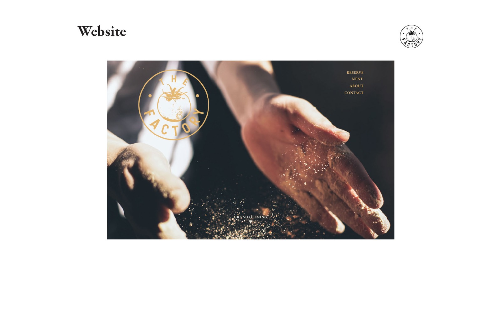
The Factory.
Student design: Holly EmersonTeaching / mentorship: Jared Trask
One distinctive voice, from first impression to destination.
The circular tomato mark, warm red and gold, and confident serif type carry through the proposed banner ads and website. Scale and image choice give each format its own composition while keeping the same visual voice.
Campaign consistency
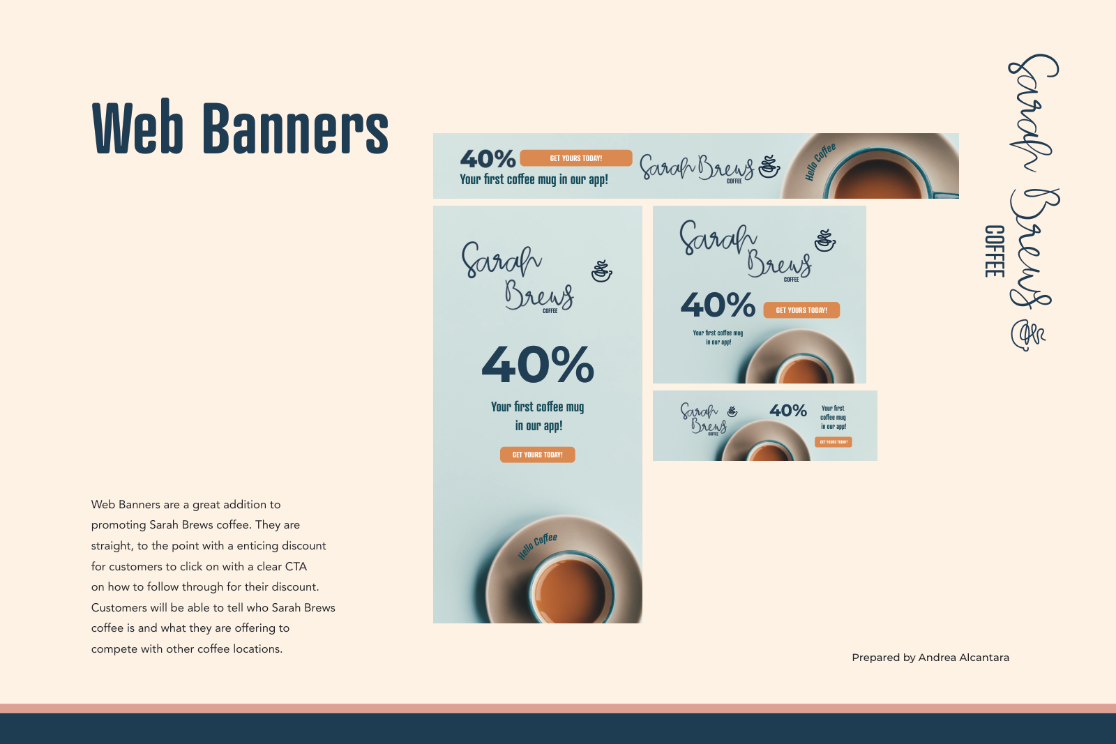
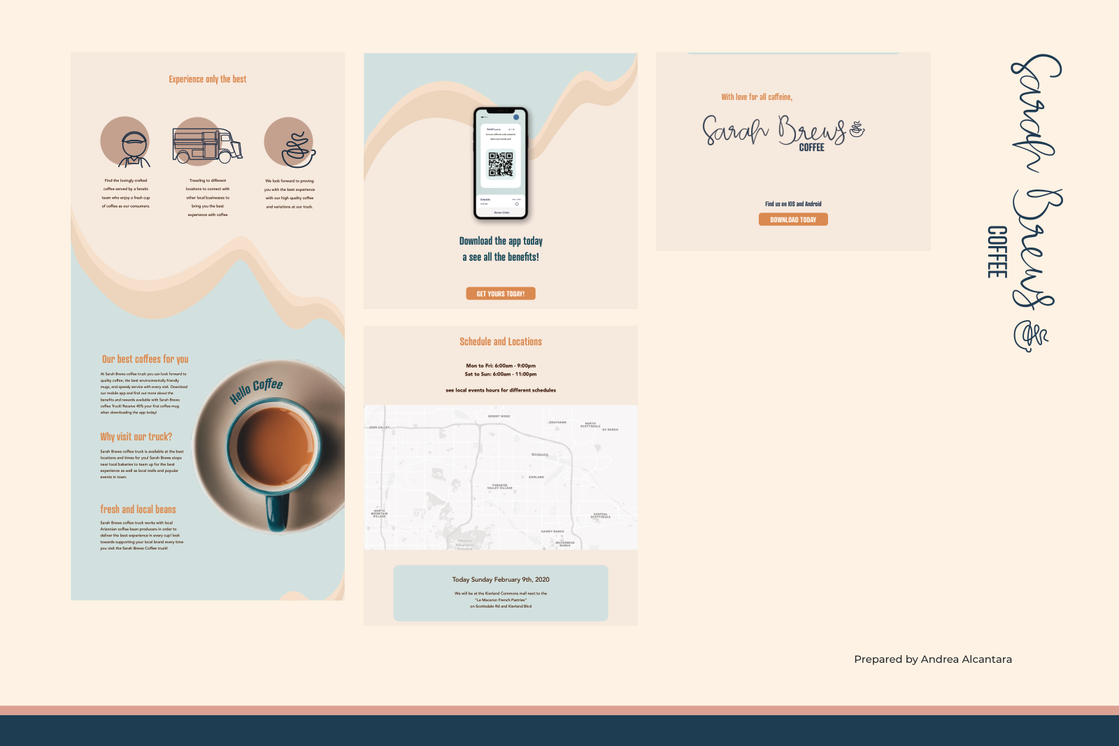
Sarah Brews.
Student design: Andrea AlcantaraTeaching / mentorship: Jared Trask
The same story, at every size.
Soft blue, cream, navy, and orange unite the coffee brand’s banner family and landing-page layouts. Repeated imagery and calls to action connect the ad’s invitation with the proposed digital experience.
Strategy into identity
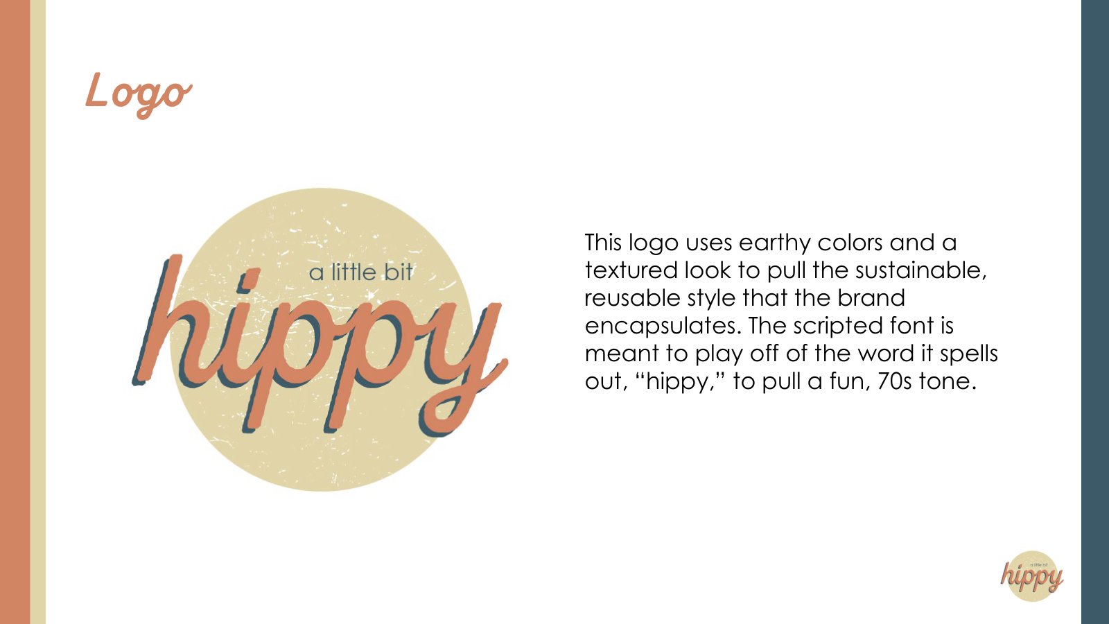
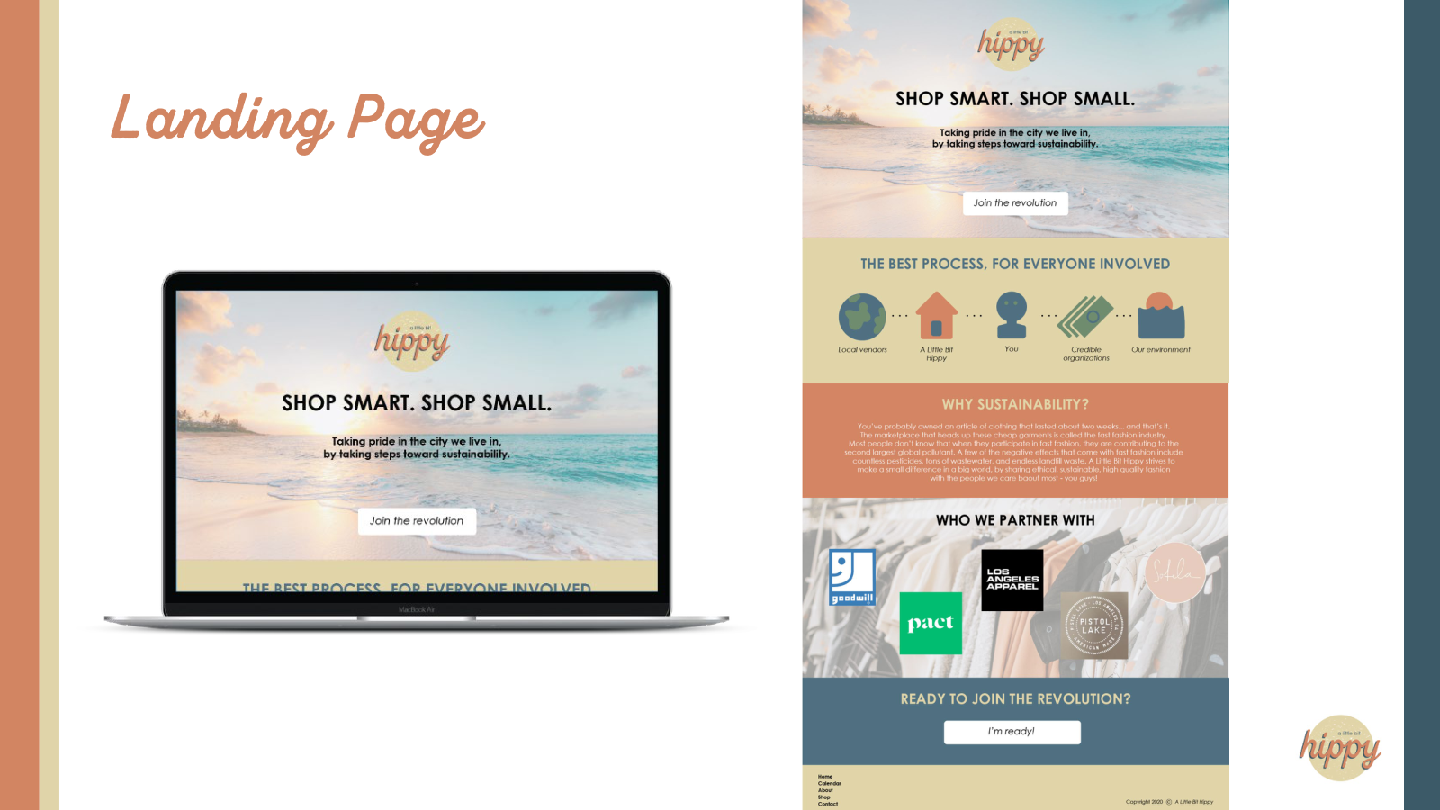
A Little Bit Hippy.
Student design: Noelle SoucekTeaching / mentorship: Jared Trask
A point of view becomes a visual identity.
An earthy palette, textured script mark, and sustainability message connect the proposed identity and landing page. The design carries the brand’s values through its typography, imagery, and approach to explaining the concept.
Explore the wider teaching practice.
Teaching & Creative Leadership